QAMadness
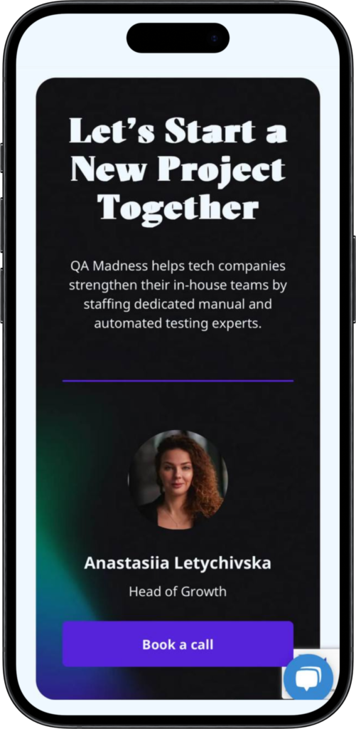
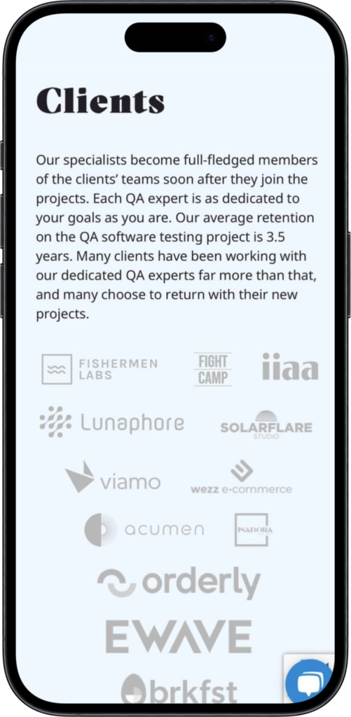
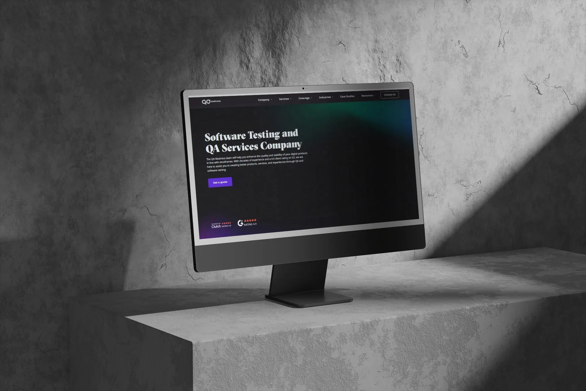
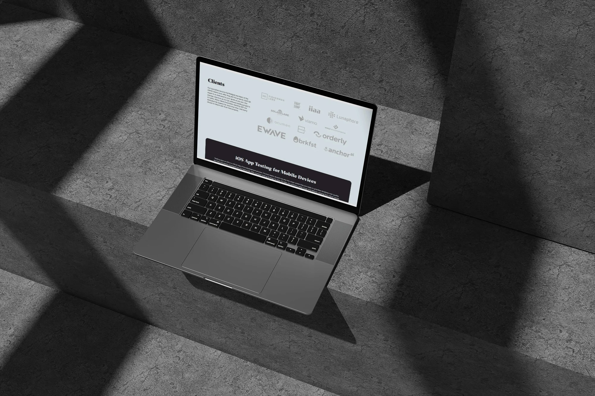
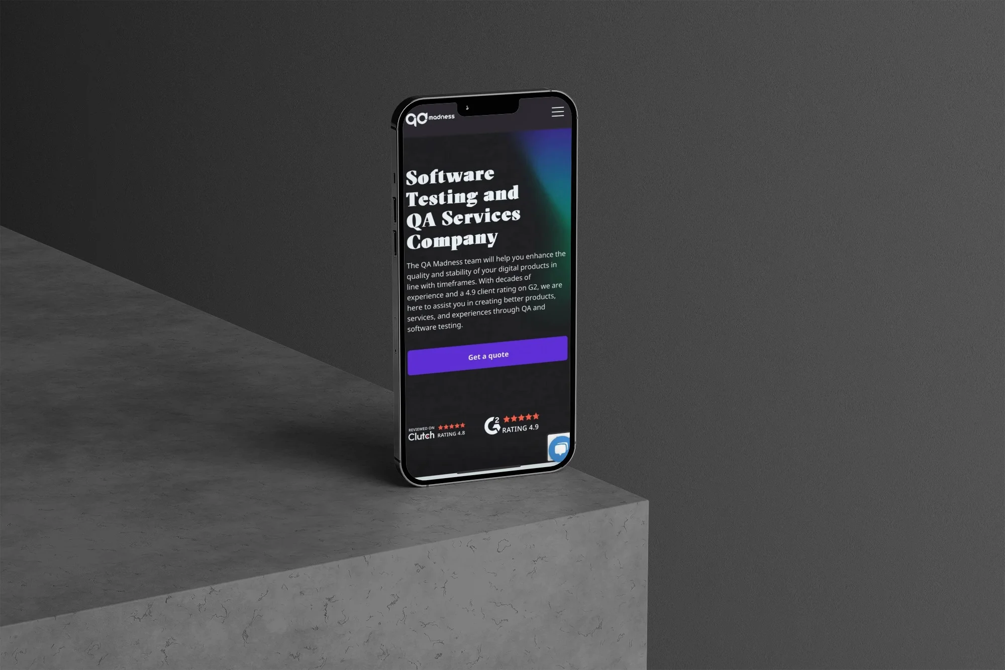
We updated the QA Madness corporate website: improved UX/UI, redesigned key pages, and implemented new functionality for a more effective presentation of services.
COMPANY WEBSITE
From concept to launch
Development
150 hours
Testing
30 hours
Design software
Figma & Photoshop
Technology
WordPress
User experience transformation
User engagement
+30%
UPDATED PAGES
+6
SITE SPEED
+25%
NUMBER OF APPLICATIONS
+45%
SITE SPEED
+25%
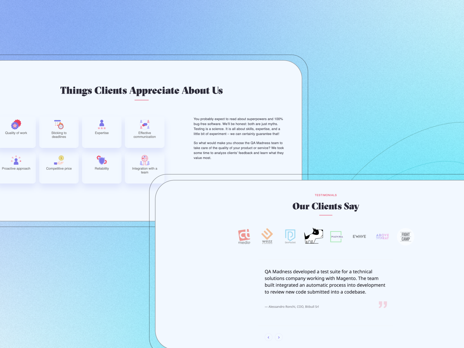
The site received a modern UX/UI, a clear structure, and updated key pages, which made interaction with QA Madness services simpler and more consistent.
PROBLEMS AND CHALLENGES
The need to update the digital experience
Outdated structure
It was necessary to update key pages of the site and make the service provision more understandable for potential clients.
UX/UI and navigation
It was necessary to improve the page structure, visual hierarchy, and logic of interaction with content.
Development of service pages
It was necessary to implement new pages using ready-made design layouts and adapt them to the existing WordPress architecture.
SEO and technical implementation
The homepage update had to be done taking into account current SEO requirements and the technical capabilities of the site.
GOALS
Creating a modern and effective corporate website
Modern UX/UI
Update key pages and make interaction with the site more clear and consistent.
Service Presentation
Structure the presentation of services so that a potential client can find the necessary information more quickly.
Figma to WordPress
Accurately implement new pages according to design layouts and integrate them into the current system.
Functional Enhancement
Add necessary functionality, forms, and animations to improve the user experience.
HOMEPAGE
Description
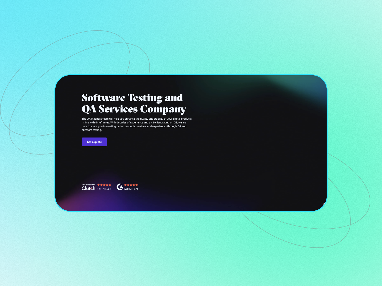
We updated the structure of the home page and made the presentation of QA Madness services and expertise more understandable for potential clients.
Decision
We redesigned the page according to the new design, optimized the content structure, and took into account current SEO requirements.
Result
The homepage has become more modern, more structured, and better presents the company's expertise.
QA SERVICES
Description
It was necessary to create a clear and convenient presentation of the company's wide range of QA services.
Decision
We designed and programmed the page using Figma, structured information about services, and adapted the interface for different devices.
Result
Users received a convenient way to familiarize themselves with the services and quickly find the right direction of QA expertise.
GAMING & CASE STUDIES
Description
It was necessary to update specialized pages and make interaction with their content more dynamic.
Decision
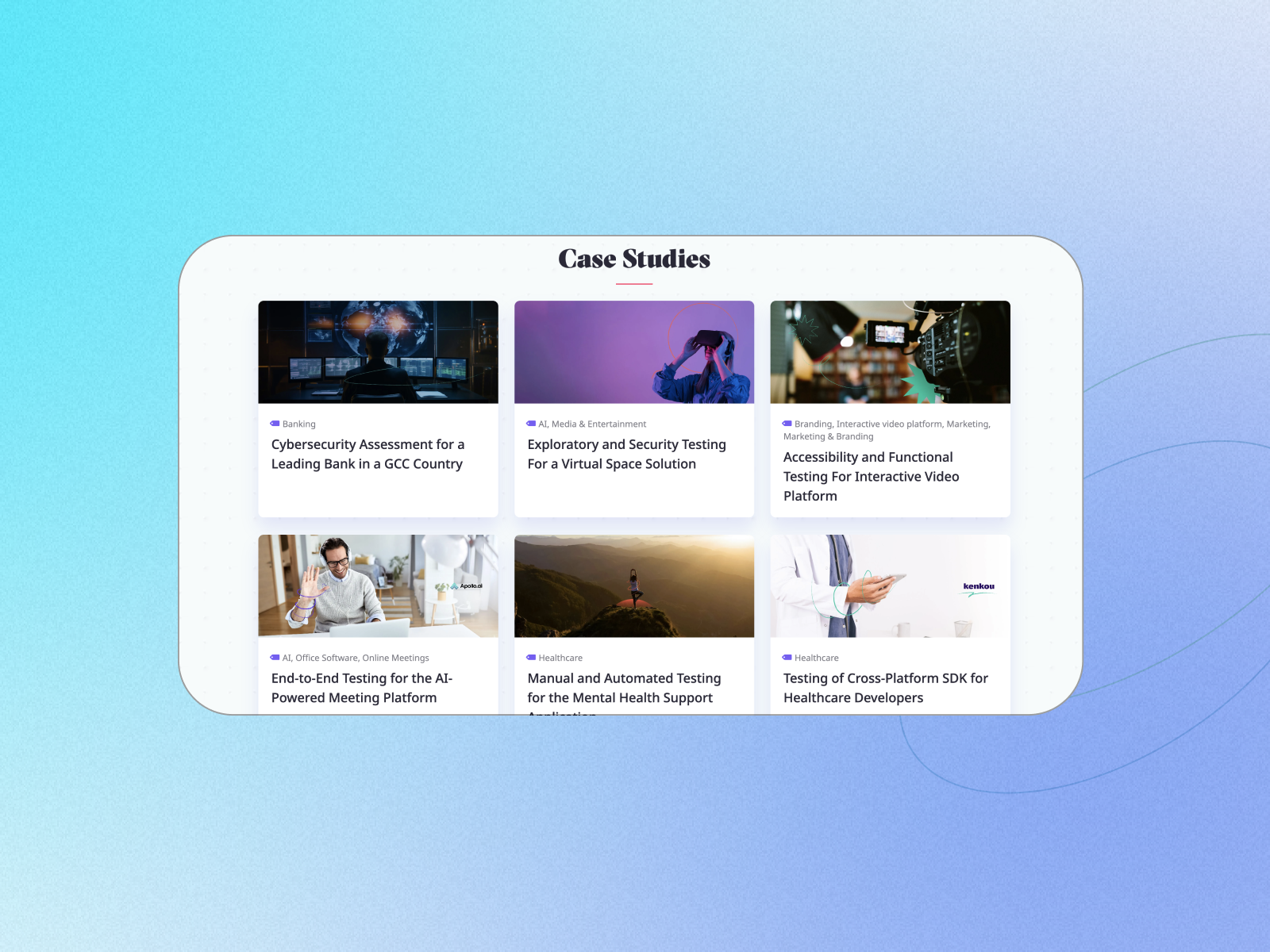
We implemented the Gaming and Case Studies pages by design, added a contact form and animations to improve interaction with the content.
Result
The pages have received a modern look, dynamic elements, and a more expressive way of presenting the QA Madness expertise.
We updated the key pages of the QA Madness website, combining modern UX/UI, responsive layout, and functional solutions to better present the company's QA expertise.
Modern service presentation: We updated the homepage and designed the Services page using Figma, making the service structure more understandable and user-friendly.
Dynamic pages and interaction: We implemented animations and a contact form on the Gaming and Case Studies pages, adding more dynamics and improving interaction with the content.
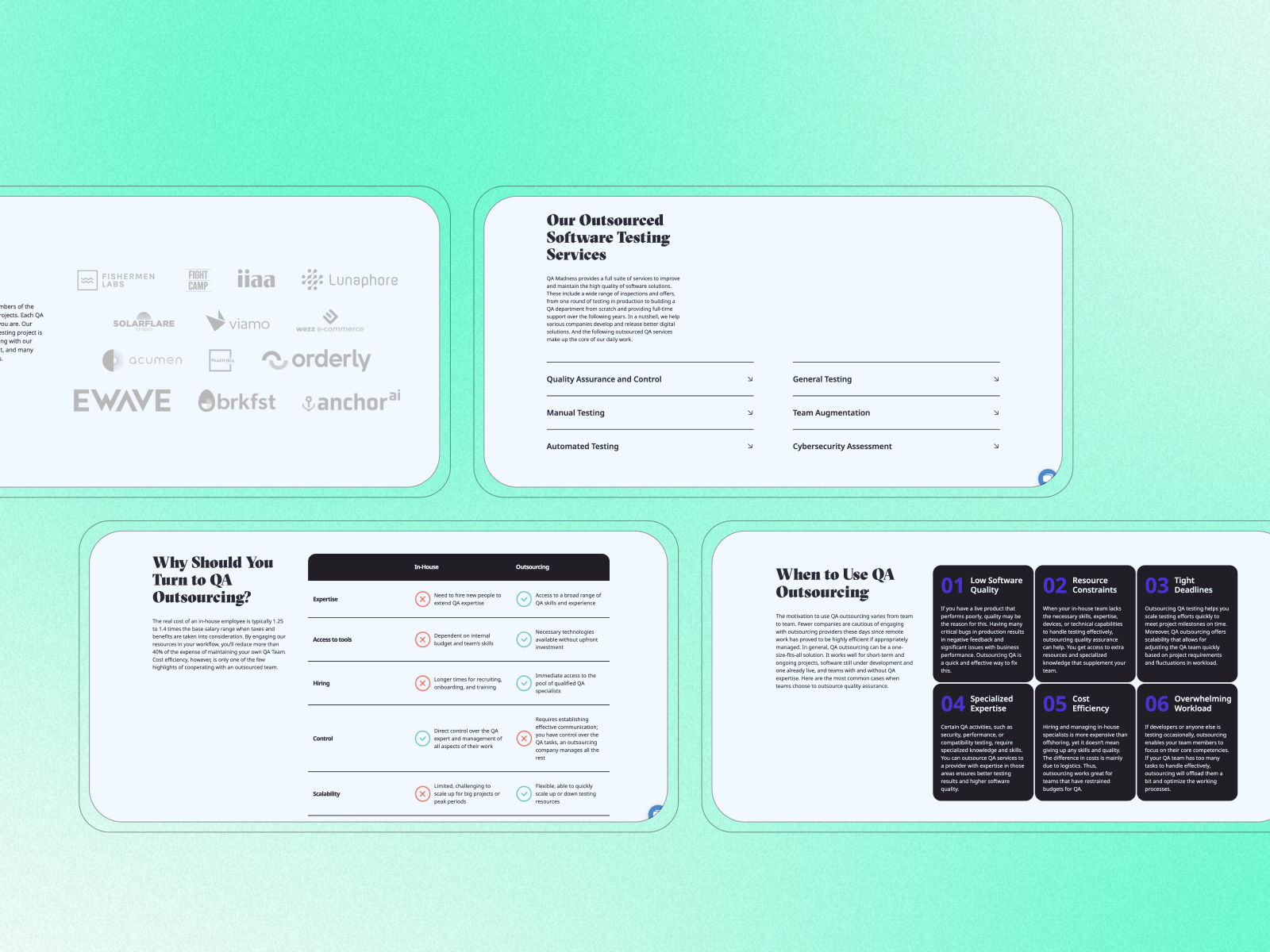
Platform development: We created the Outsourcing page and laid the foundation for further development of the site and implementation of new functionality.
«"The M1 Development team helped us update key pages of the site and implement new functional solutions in accordance with the design. All tasks were completed with high quality, and the result allowed us to make the site more modern and convenient for our users."»
— Customer feedback