




From concept to launch
UX/UI
185 hours
Development
241 hours
Design software
Figma & Illustrator & Photoshop
Technology
Webflow
PROBLEMS AND CHALLENGES
Adapting brand identity to digital
The Brand into Digital
The source materials were posters and vintage graphics that were not adapted for the web. It was necessary to preserve the spirit of the brand without losing usability.
Choosing the Right Platform
Classic e-commerce solutions did not provide the necessary freedom in animations and transitions that the design required.
Aesthetics & Functionality
It was necessary to combine a non-standard design with clear navigation and a convenient purchasing process.
GOALS
Creating an online store that conveys the brand's lifestyle
Design & Visual
Implementation of urban design with an emphasis on posters, typography, and vintage aesthetics.
Platform
Choosing Webflow as the platform that best fits the philosophy and flexibility of brand animations.
UX
Classic online store logic, complemented by non-standard transitions and visual effects.
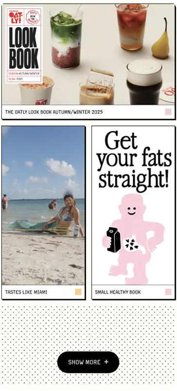



HOMEPAGE
Description
We created an emotional first screen that introduces the user to the brand through bold typography and bright visual accents.
Decision
We implemented an adaptive Hero block, interactive sections, and smooth animations that create a holistic brand experience from the first second.
Result
The homepage became an extension of Oatly's identity and an effective entry point for getting to know the brand and products.
PRODUCT PAGE
Description
We built a page around the product, combining visual presentation, features, and brand history in a single interface.
Decision
We optimized the content structure, added a convenient gallery, blocks with product descriptions, ingredients, and benefits.
Result
The user receives all the necessary information quickly and in a comfortable format, which has a positive effect on interaction with the site.
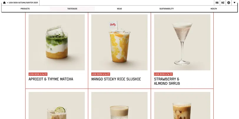
NEWS
Description
We created a brand information center for publishing news, press releases, and corporate materials.
Decision
We implemented a structured news catalog with filtering by years and sections, ensuring a convenient search for relevant materials.
Result
The section became the only source of official information about the brand, improved the user experience, and supported the company's information openness.


We created not just a corporate website, but a digital space that continues the communication of the Oatly brand.

Urban design without compromise. We brought Oatly's corporate identity to the digital space, preserving the brand's character through bold typography, unconventional compositions, and smooth animations.

WebFlow as a marketing platform. We built a site that allows the team to independently update content, launch new campaigns, and quickly adapt pages without involving developers.

Fast and intuitive user experience. We combine a vibrant design with logical navigation and high performance to make every interaction with the site comfortable, regardless of the device.

The M1 Development team was able to convey the mood of our brand in every element of the site. We received not just a beautiful design, but a platform that is easily scalable, convenient for the team, and helps develop the brand in the digital environment.
— Customer feedback